A Winter’s Game!

I’ve recently gotten busy delving into some juicy graphics work for uni’s chess club: an absolutely mental group of funny, nerdy people who have the craziest dedication to chess you have seen, popping down for six hours on a Friday evening to engage in the sort of mental stimulation only a game of chess can bring. Why have I been hanging out with these guys for the last ten months? It’s partly to do with the fact that they’re still waiting for my punchline. I, their undercover foreign correspondent, the monocle-wearing, fedora-tipping, moustache-twirling, English columnist known only as James (long story), was supposed to bring my so-called knack for a joke and turn it into a fancy comic making the chess club seem funny. They are funny. I’m just not very good at chess jokes, and that, surprisingly, is why I haven’t yet been kicked out.

But my chess comic is a story for another day, partly because because it’s a story I haven’t begun just yet. This one’s about a promotional poster I’ve cooked up for their latest tournament: a holiday open, perfect for the winter! If you happen to be in Toronto, you probably know, or can easily find out about this event, but just for simplicity here, I’ve deleted all specifics. This post is just about the design process!

Queen promo Holiday open Copy (1)
Although Hogwarts probably has a winter chess tournament too. It might be as exciting as this one!

The poster was made in Adobe Spark, and probably took me all of two hours, because Spark is a right blessing for late night artwork. Its array of vector icons made it really simple for me because I didn’t have to draw out the icons from scratch. Part of me is still at war with the idea of taking a short cut and cheating on the icons: I didn’t make them, I’m just using someone else’s art! But it’s also kind of ridiculous to invent the wheel over again when something that works perfectly well sits right on my screen.

Alright, where do we begin? Probably the poster’s background, because that’s where the thinking began!

For this particular poster, I decided to go with easily recognisable tropes: winter, cold, snow, blue, and of course, chess!
Because it’s currently exam season and the only reason anyone would be on campus in this weather would be if they’re running to an exam room or going to a library in hope of getting a few peaceful hours of studying under their belt, I’ve got to presume anyone looking at this poster will be preoccupied, and won’t be able to spend any more than a few seconds looking at it.

This is where the easy connections come really handy! Out of the few things I’ve listed above, I picked the keywords winter and chess.

Picking a representative for chess was easy: it was going to either be a piece on the board, or the board itself! I chose the queen, because somehow, her regal figure seems to demand that you look at it!
For the winter theme, I decided not to complicate things: a scarf, to keep warm, lots of cooler colours to really send the theme home, and a snowflake to make it more obvious. Part of me had really wanted to up the queen’s sass by giving her a mug of coffee, but the key principle here was simplicity, and what finally won out was the fact that I wasn’t ready to lose a reader to too much clutter: the Queen and the snowflake take up about 80% of the poster, and they do their job well.

To contrast with all the cold and to make the Queen really stand out (and appeal to the cold hustler-by), I decided to give her a warm afterimage.

I’ve recently realised that there is a lot you can learn by deconstructing a professional’s work! No, it’s not sadism, and it’s not jealously; it’s simply a learning process! Just carry on deleting layer after layer to find out how something that looks really complicated came together, and you’ll often find it’s just composed of simple shapes overlapping.

That’s what gave me the afterimage idea, along with some heady space-time sci-fi episode I’d seen on an animated show once.

deleterious holiday open copy
I’ll be honest, they look more intimidating this way. There’s strength in numbers! I couldn’t trust myself to get past that formidable wall. No wonder everyone fears the queen piece the most: she looks the part!

So I started with a single solid layer, and kept adding analogous colours on each side


In case anyone else needed a refresher in colour harmony terminology… because I did.

Putting all the pieces together (pardon the pun… I’m a comic artist-in-training for the chess club!) was meant to create a warm, hazy afterimage, sort of how you’re supposed to be feeling after a few hours of losing yourself in Chess MagicLand. I gave her a few “layers”… because live (the winter) by layering is my mum’s mantra. A few translucent layers of scarf and toque later (or as my mum would call it, “well, I never!”), our queen’s ready to face the harsh outdoors.

The tagline was really the reason why I made the poster, the line stuck around in my head, and the image followed after.
I could possibly dedicate this entire poster to my mum because as she would ask me on the phone as I head out, “Are you properly ready? Scarf? Hat? Muffler? Coat? A jumper inside?? You’re not ready if there aren’t two jumpers underneath!” All I can manage to mumble out, muffled by my scarf is, “mmf”, but the words did stick around!

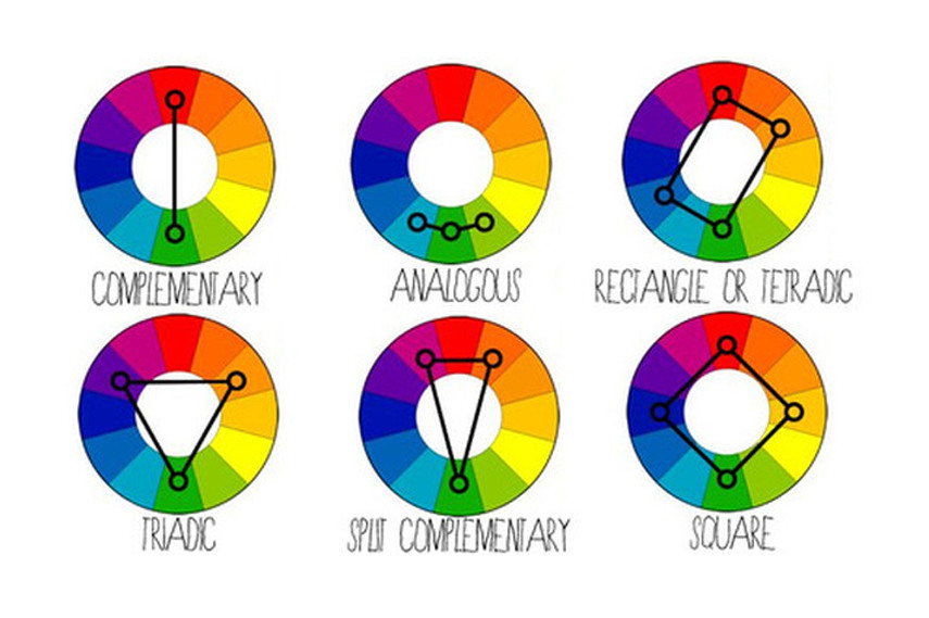
The tagline needed to be highlighted with a contrasting complementary colour (see dandy reference table above), so I went for the oranges, but just sticking with the not-so-loud (but in no way subdued, just classy) theme, I went for a milder peach and pink. Once again, using my latest weapon in the armoury that is layering with transparent shapes, I put together the background circles and the text (again, contrasting to stand out), and sealed it with a solid ring to surround it.

deleterious holiday open copy (1).jpg
Venn diagrams! Settle down math class, what did you think this was—art?!

Again, the text has to go with the theme, and I’m hoping it does, because I’m honestly not very good with fonts. I won’t even pretend to be the expert there.

Then finally, in a hark back to ye olden days of war and battle (ah, the ignorance in that statement),  I decided I wanted our not-chess club’s name to be sewn in gold into a red silk banner. Of course, that was not going to be the best idea for sticking with my blue theme and not causing too much chaos on our workspace: giving the eye too many strong focal points to choose from robs it of the chance to just drift over the sheet and take it all in for itself, and it’s more likely that in such time, the only focal point calling the eye will be the white steam of that nice hot mug of coffee growing clearer in the mind’s eye; onward ye, to warmer, happier places!

So the banner’s blue, with only a little bit of a contrasting pink to catch the eye. The reverse has been applied to the big information line at the bottom, which at the end of the day, is the real reason for this poster (my artistic whims aside)!

For a final touch, we add the massive grey snowflake, filling in the negative space with just enough not to clutter it, and also making up for the fact that I was not willing to individually drag and centre every one of the queen’s five shadows and rearrange them, something that Spark should probably look into, because design sites like Canva let you bulk select and move stuff. Thank heavens for the snowflakes. Which, come to think of it, is technically correct because that’s where snowflakes come from.

So there we have it, a nice, completed poster, which out of sheer vanity and in desperate search for some sort of completeness to this article, I will post a picture of again. It’s not the only poster I’ve made for this very chess tournament, because I still haven’t found the golden chess punchline that might finally allow me to ditch the guise of the enigmatic monocle-wearing, fedora-tipping, moustache-twirling English columnist known only as James, foreign correspondent. Frankly, I’m warming to the role quite nicely.

So expect a few more posts of this sort as I take you on another magical journey through the coffee-filled wee hours that I spend on designing posters for the chess club that has held me semi-prisoner. Till then, let this finished product keep you warm tonight; James out.

Queen promo Holiday open Copy (1)

Boo

It’s been a really long time since I’ve posted anything on here. It’s not so much because I’ve hit some sort of creative rock bottom, unable to move pencil over paper, unable to fathom where people get their ideas from, marvelling at the sunlight from within my sinkhole of no motivation.

I’ve had motivation to draw, and I have had ideas. The one thing I’ve lacked for months is the motivation to scan and post.

I’ve returned a few months later and feel anachronistic. So much has changed, and I want to go back to the “good old days” of easy scanning and not worrying about watermarks taking over the punchline (what a twist!); I never thought I’d get old enough to be able to say the words “good ol’ days” knowingly. Not as a historian peering down their monocle. What a wonder.

And of course, the old “sum it up in three words” nightmare. I am genuinely horrible at captions and titles. Look at this one’s title. “Boo.” Does it get worse? Yes, it’s a Halloween comic, yes, it will scare the shit out of stats/maths/physics majors, but ‘boo’? That’s the punchline! And now I’ve given it away twice!

Oh gosh darn it, just have the comic, I’d make a terrible suspense writer. No wonder I’ve been hibernating all October.

BA007A76-A133-4208-8C75-08DF634A1CCA

Maybe November will be better. Movember? Yeah, sure, I can do that. I can do that, can’t I?

I honestly prefer ‘Hibernate December’.

Work Days

Unfortunately, this isn’t even a lie, it just happened hours ago, and I’m still shivering. The laptop then proceeded to hiss at me and spew out some un-kid friendly stuff through its spinning fans. It also then promptly decided, that it didn’t want to run my code afterall.

And then he ce just been sitting and staring at it in retaliation. It’s been a productive day.

In other news, I rediscovered line of action, and I’ve been trying it out in the comics. If anyone looks weirdly bent, now you know why.


Pushing that pen as far as my napkin allows!

It’s super interesting and really informative cuz I’d been so busy trying to go for realistic poses, that I forget how interesting uncommon sights make a visual!

The original’s at a blog on cartoonsnap.com (with this being the original post)

And now with that trauma behind me, I’m off to bed. May Recycle Bin haunt your dreams too. Good night.

Filling It Up

After months of filling forms, your doctor’s appointment will begin to read like your latest college application.

Name: Mr. James Owen
Age: 18 years old
Sex: Male
Date of appointment: Freshman, undergraduate, 2019-20
Reason for visit: Ever since I was a young child, I have wanted to visit the doctor. This selfless man with the white coat and the stethoscope asking me to take a seat as a four-year old on Christmas morning with a Thomas the Tank Engine play-set stuck in my mouth, shoved in with Thomas and a few of his mates intact (or maybe not) in pure excitement of the sort only a four-year old high on Nesquick on Christmas morning could be, I was enraptured by this man and his love for his art, and the enigmatic pearls of wisdom he occasionally sprouted.
He spoke seldom, and when he did, it almost wasn’t ordinary human English.
“Aaaah”, he said, and while that should have made no sense at all, somehow, I understood the man. His command over his subjects was complete, his composure and dignified mannerisms subtle, yet screaming.
He nodded ever so slightly and passed me an ancient puzzle, a few scratches on a paper. Once again, while none of this made any sense to me, mum seemed to understand, he was universal; she nodded, although I felt her body relax for some reason, as in defeat.
I—

‘Oh shit, I think I’m close to the word limit, I gotta end this!’

*scratch, scratch*
“—That incident left a very deep impression on my younger self, and for the last fifteen years, I have only had one thought every night that I go to bed: I would like to study medicine at Harvard.”

‘There we are, now we just sit and await that call.’

Ten minutes later, a nurse walks out holding a clip pad and a wearing a concerned expression.

‘Mr. James Owen?’
‘Yup, that’ll be me. Tell me, did I make it?!’
‘Mr. Owen, it’s alright, I’d like you to come with me.’
‘Definitely!’

‘Nurse, where are we headed?’
‘We read your profile, James, and there may be a slight problem,’
‘Oh dear! Would you need an additional portfolio? Recommendations? My thesis from summer research?’
‘No Mr. James, you’re really sick, and just to make sure you’re not a hazard to yourself or anyone around you, we want a little check up.’
‘Nurse, you must have made a mistake, I’m perfectly fine! Take a look at my athletics! I played for Junior Varsity, I’m very fit indeed!’
‘Don’t worry kiddo. It’ll all be okay.’
‘No, no, what does that mean? I’m perfectly fine, I told you, I’m not crazy! Are you rejecting me?!’
Nurse smiles sweetly
‘We only wish the best to you now, and in all your future endeavours. Come with me.’
‘What?! Nooooooooo!!’

Low Efforts and General Wastes of Day

Sometimes, people give me anxiety. There doesn’t have to be a reason. It can just be that I’ve spoken to a sum total of one person (the puppy) and my quota for the day has been filled up to its maximum.

Other days, the reason is mostly that it was a holiday and so I’m sitting in my nightdress without having brushed my hair and generally looking an embarrassment.

And today was such a day. Someone was over, I had an idea, and wanted to run up to get my napkin and pens. (In case you didn’t know, all my comics are done on the kilograms of spare napkins I have from sitting in the uni dining hall for eight months. Why do I know it’s a kilogram? I weighed my freaking luggage.)

But in order to get to my supplies, I needed to cross the hall with the table with our extra someone on it. Someone who’d get a shock to see the very epitome of college garbage walk out like this. So I figured I either had to postpone my comic, me, the math kid who’s been taught to live on the mantra “oh well, if you forget it on a test, just derive it!” for eight months (spoiler: it doesn’t work for all of us), would have to remember this idea a few hours later, or improvise with what I had.

Given the “what I had” was a laptop, I improvised.

Presenting, the world’s least effort filled comic.

I literally used stock icons to make this one, as you can easily tell, and well, it still took me two hours.

Oh well. Gape and wonder at the height of collegiate human degeneracy.

I thank you all.

Music Festival Poster

It’s finally summer! Summer, for those not from Toronto, Ontario, Canada, means double digit temperatures and warm, if any, winds and long hours of sunshine. To Torontonians, it just means next week might not have surprise snow showers.

But undoubtedly, one thing most people look forward to during the summer is the outdoors. Last week, I finally saw the basketball nets on our streets thaw and people staying out of a nice, heated building for more than ten minutes. Toronto as it may be, this means summer is here!

Music festivals are my favourite things about the summer. Every cold winter, I would wait in heavy anticipation for the next year’s juicy lineup at Reading and Leeds, Glastonbury, Pinkpop, Rock Werchter, Download, Eurokéenes, Rock Im Ring and a ton other European and North American summer music festivals,  to see whose shows would I be hoping to get lucky and livestream on YouTube.
Yeah, for all my enthusiasm, there wasn’t a major music festival for miles around where I lived. But hey, thank goodness for YouTube and other enthusiastic fans, right?

Last year, when I’d moved to Toronto, I read a long article outlining the reasons why Toronto’s outdoor music festivals were dying. A major contributing factor was the lack of space in the heart of downtown, a place which is otherwise an artist’s favourite Toronto venue with smaller bands playing at the scores of pubs, bars and taverns, and with more iconic venues like the Danforth music hall, the Royal Conservatory, Lee’s Palace, the Bovine Sex Club, Phoenix Concert Theatre, and the likes of the larger, more ambitious arenas like the Scotiabank Arena (formerly the Air Canada Centre, happy purists?). If you’re planning on popping down to Toronto anytime soon, I hope you were taking notes!

So I thought, heck, just for an imaginary two days, let’s bring back the music to the Toronto outdoors! And while we’re at it, let’s also fill up my portfolio, shall we?

So I present to you all, Toronto’s all new Hi-Breathe Festival!
For two days from 24th to 25th July, join fellow festives and music lovers at Trinity Bellwoods Park in downtown Toronto for music as diverse as the city itself. From the big name headliners (including Morrissey returning to Canada in more than a decade) to artists you’ve never seen before, prepare to leave amazed.

Tickets will go on sale later this month…

Not! 

It’s a fictional festival, for goodness sake, if anything here is supposed to amaze anyone, it would be either the surprising genuineness of my poster and pitch (*ahem* quality, innit?) or your total gullibility.

Before you phone up Ticketmaster demanding your fair share of tickets (capped at 8 per person) to this super exciting looking music festival you’d read about online this week, there’s no such festival happening, but you can check out the lineup anyway. Half these bands don’t exist yet, so that would sure have made for an interesting day. Maybe it would be the start of the next Monkees, who knows?

Note: I had better band names on the first draft. Then I lost internet connection and my supposedly faithful autosave showed its true colours.

Made in Adobe Spark. So remember, ladies and gentlemen, always manually smash that Ctrl+S a few hundred times yourself; goodnight.

Create a website or blog at WordPress.com

Up ↑

Design a site like this with WordPress.com
Get started